
In the digital age, where mobile internet usage surpasses desktop browsing, having a responsive website is no longer a luxury but a necessity. A responsive website design ensures that your site looks and functions well on any device, whether it’s a smartphone, tablet, or desktop computer. In this blog post, we’ll explore the multifaceted benefits of responsive design.
What is Responsive Website Design?
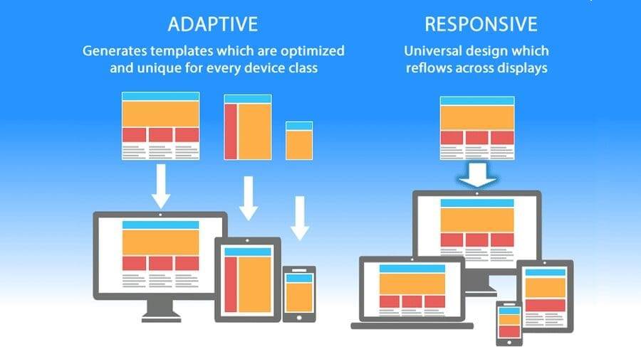
Responsive website design is an approach to web development that allows web pages to render well on a variety of devices and window or screen sizes. It involves using flexible layouts, flexible images, and cascading style sheet media queries. This ensures that users have an optimal viewing and interaction experience across a wide range of devices. The website should be able to have a consistent look on mobile, desktop, tablet, etc.
Key Benefits of Responsive Designs
Enhanced User Experience
- Seamless Navigation: A responsive design adjusts the layout automatically, making navigation intuitive and straightforward, regardless of device size.
- Consistent Experience: Users enjoy a consistent look and feel whether they access your site via a mobile phone or a desktop computer.
- Faster Load Times: Responsive design often involves optimizing images and employing efficient coding practices, resulting in quicker load times.
Improved SEO Performance
- Google’s Preference: Google prioritizes mobile-friendly websites in its search results, meaning responsive sites can benefit from higher rankings.
- Single URL Structure: With responsive design, you maintain a single URL for each page, simplifying SEO management and avoiding issues with duplicate content.
Cost-Effectiveness
- Single Site Maintenance: Maintaining one responsive site is less costly and time-consuming than managing separate sites for different devices.
- Future-Proofing: A flexible layout can accommodate new devices in the future without requiring a complete redesign.
Increased Conversion Rates
- Reduced Bounce Rates: As users can easily navigate a responsive site, they are more likely to stay longer, reducing bounce rates.
- Enhanced Accessibility: A broader audience can access your site comfortably, increasing the chances of conversions.
Practical Tips for Implementing Responsive Design
- Use Fluid Grids: Design with a fluid grid that resizes elements in relation to one another, based on the screen size.
- Flexible Images: Ensure images scale correctly within the containing element.
- Media Queries: Utilize CSS media queries to apply specific styles for different device sizes.
- Use Professionals: Using a professionals expertise could ensure your website does is expected.
Conclusion
A responsive website design is a crucial component for any successful online presence. It not only enhances user experience and improves SEO but also offers a cost-effective solution for maintaining a versatile and future-proof website. As technology continues to evolve, adopting responsive design ensures your website remains relevant and accessible to al/l users.
Embrace responsive design today to stay ahead in the digital landscape and provide your audience with an exceptional browsing experience.
Did this blog help you? Click here to view our other blogs!